And what’s the clearest trade on all these trends…

Here’s more on the macro-economy, the important trends inside of it, and how it is informing our analysis and portfolio positioning. I’ve spent the last couple weeks researching correlations between the broader macro economy and the stock market. We’ve been very successful and profitable in positioning for a new tech stock bubble since I launched this newsletter and my analysis continues to keep my bucket in front of that blowing up bubble. I’ve got several research associates putting together the charts and data for us and below we look at the major macroeconomic trends of the last handful of years and layer each one on top of the stock market.
First thing you’ll notice is how remarkably correlated the macroeconomic trends are with the stock market in recent years. While the markets have always correlated with earnings over the long run and since earnings have always correlated with the broader economy over the long run, the market tends to reflect the broader economy over time. But never before has that reflection and correlation been this accurate and this direct and this quick.
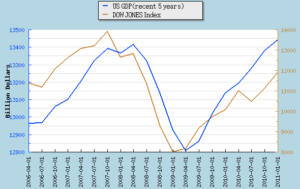
First off, look at the mirrored charts of recent US GDP and the DJIA:

Source: CL Willard Capital Management, Marketwatch, Yahoo Finance and the US Bureau of Economic Analysis
Next, how about the clear parallels between the labor market that has clearly turned higher but still not creating enough jobs in this nation. Those jobs being funded with new public money at LinkedIn and with huge growth at Apple and its new spaceship headquarters add up to help counter the continued shrinkage in the financial sector such as at Citi and BofA:
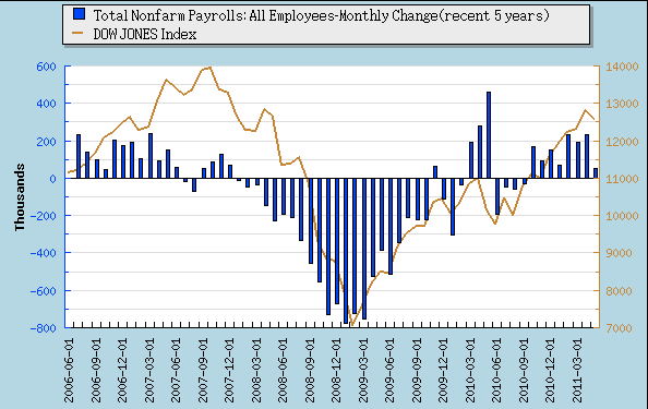
Source: CL Willard Capital Management, Marketwatch, Yahoo Finance and the US Dept of Labor
And if you thought those charts were uncannily correlated, how about this one, a picture of retail sales activity and the broader stock market over the last few years. The Gap, Staples and Home Depot marketplaces are in rebound mode:
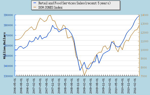
Source: CL Willard Capital Management, Marketwatch, Yahoo Finance and the US Dept of Commerce
Finally take a look at this chart and you can see that the Fed’s far behind all these charts with their still unprecedented easy monetary policies. Put simply — this following chart is how bubbles get blown and it’s a large part of why I’m betting so big on a coming bigger-than-ever tech stock bubble:
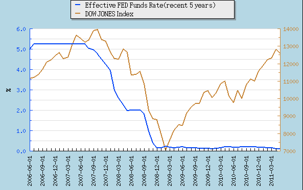
Source: CL Willard Capital Management, Marketwatch, Yahoo Finance and the Fed Reserve
That chart and the willful there just blows the mind. And it doesn’t even take into account QE1 and QE2 and the bailouts and the fact that Goldman, JPM and Citi and the other TBTF banks have traded trillions of mortgage backed securities likely worth 20-30 cents on the dollar for Treasuries worth 100 cents on the dollar…and that continues to happen every day. Like I’ve been saying for a while now, I’m fully expecting to see a huge new tech stock bubble that I will call the “echo tech-o bubble” and we’re right now about 20-30% of how big it will eventually be before this monetary and stock market cycle turn.
Most pundits and investors are worried about when the Fed will finally start reversing this unprecedented monetary expansion. One of the most followed sayings on Wall Street is “Don’ fight the Fed.” But the fact of the matter is, as I’ve pointed out to you guys before, that the Fed is always late in starting to raise rates and that you want to own stocks up until the time when the Fed finally starts to look to lower rates. Look at these two charts below and see how the stock market boomed up until just before the Fed started to cut rates:

Source: CL Willard Capital Management, Marketwatch, Yahoo Finance and the Federal Reserve
Here’s another version with an extra ten years of history using the S&P 500 instead of the DJIA so you can see how much more correlated to the Fed Funds rate the stock market has become in recent years:

Source: CL Willard Capital Management, Marketwatch, Yahoo Finance and the Federal Reserve
And what’s the clearest trade on the Fed’s bubble brewing and debasing of the dollars you’ve worked your whole life to save? I come back to the DBA, as it’s an ETF that’s full of things like corn, cotton, soy and other commodities that people consume every day to survive around the world. Look back at the Fed Funds chart and how they continue to play a game of chicken with runaway inflation and bubbles and then look at how prices, even as measured and dramatically tamed down by the government, are continuing to spike while the Fed chills at 0%:

The Fed continues to say its policies are not impacting prices, but there’s a clear trend of steadily higher prices, and it’s just about the only chart that goes straight up with no correlation to the broader stock markets and broader economy as most of the others currently have.
I don’t know whether I’m fighting the Fed or not fighting the Fed or what, but as investors our job is to analyze all of these factors and inputs to inform our analysis and maximize our returns while minimizing our risks…and all this analysis continues to lead us to conclude that the greatest asset bubbles our country has ever seen are being sown right now. Screw the Fed, let’s just make money.